
Johanniter
Flexing a star
Service
Redesign, Brand experience & Impact
Industry
Aid Organization
Team
Creative: Olivier Nowakm, Malte Preiss, Sebastian Braun
Project Management: Heiko Franke, Yvonne Haupt
Strategy: Sabine Gräfenstein, Laura Unrau
Photography: Monika Höfler
Sound design: Stefan Benz
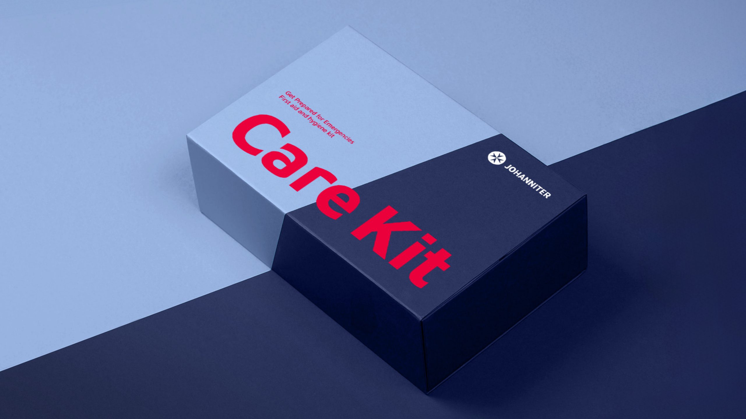
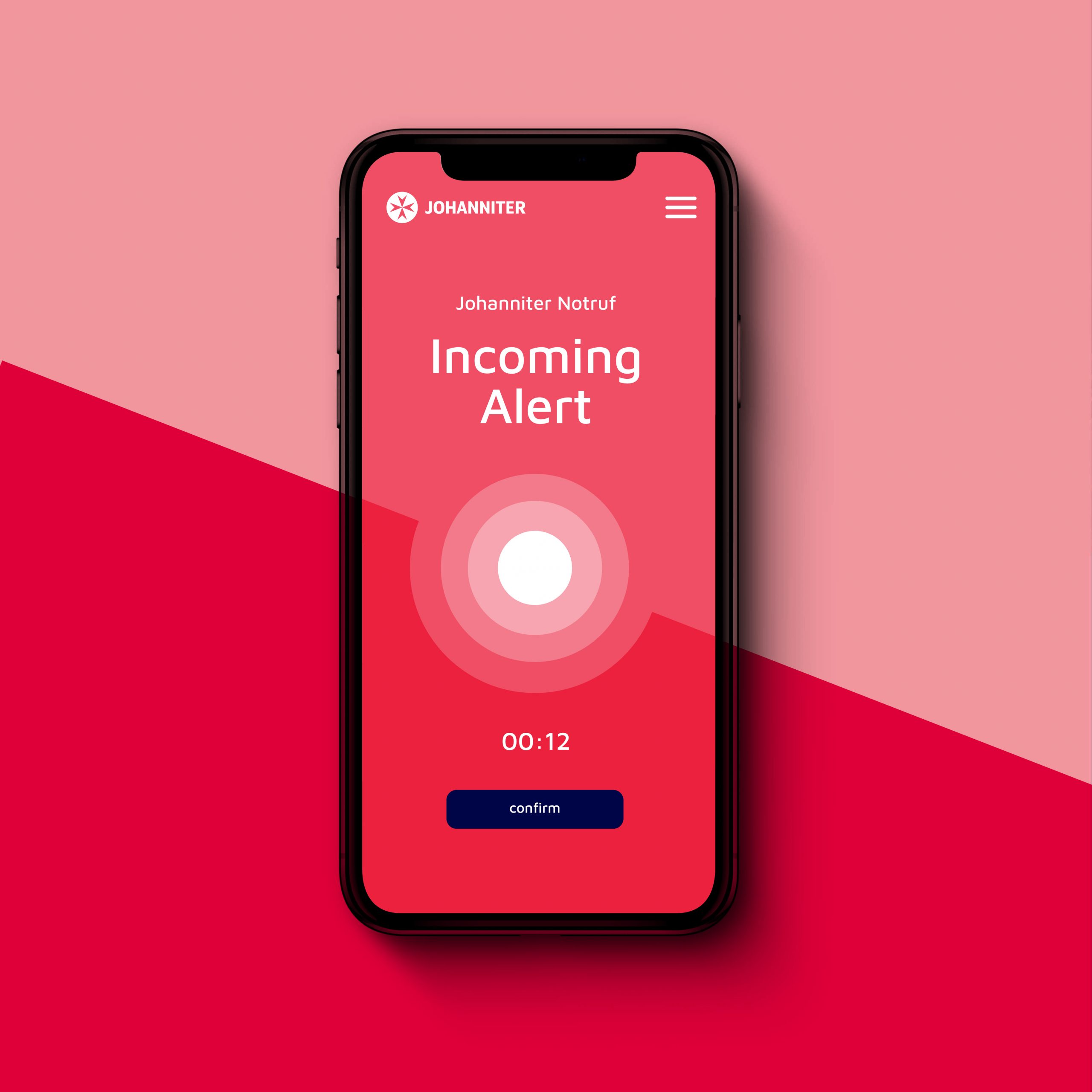
With around 25,000 employees and 40,000 volunteers, the Johanniter Organization offers a wide range of services. The identity struggled to reflect this in a simple, flexible manner that captured their values and ensured clear distinction.
Based on their traditions and origins, Johanniter aims to give people hope, security, and a passion for life.
What we did
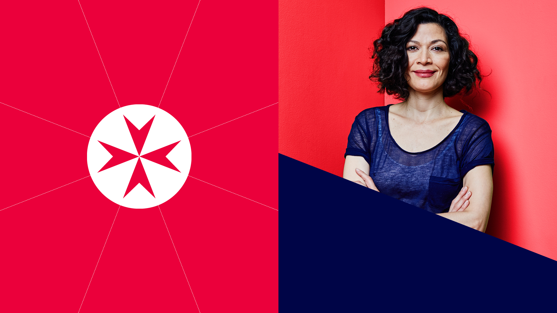
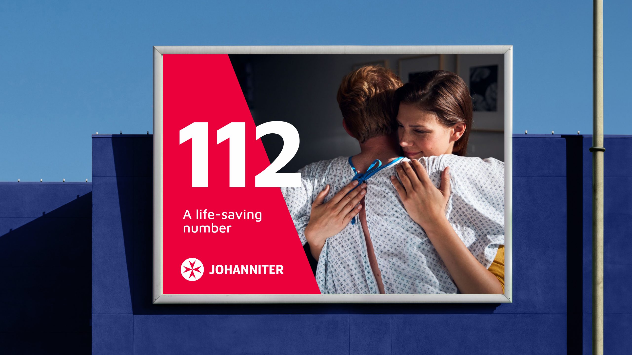
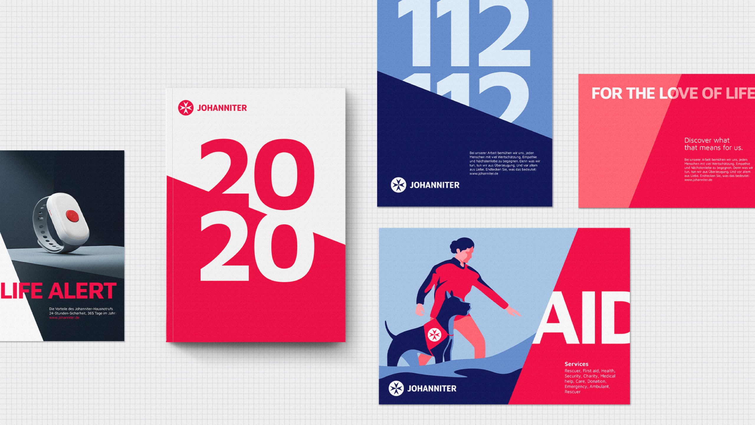
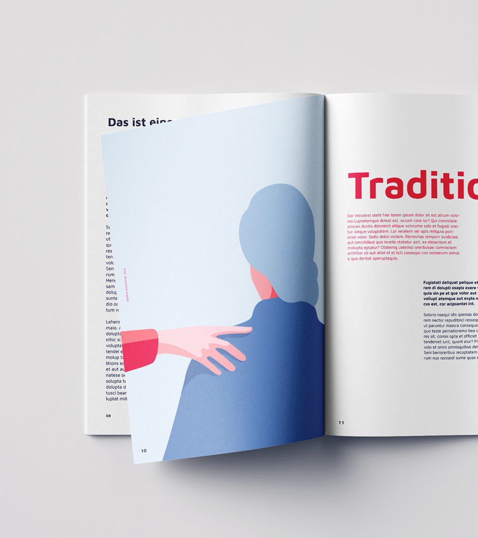
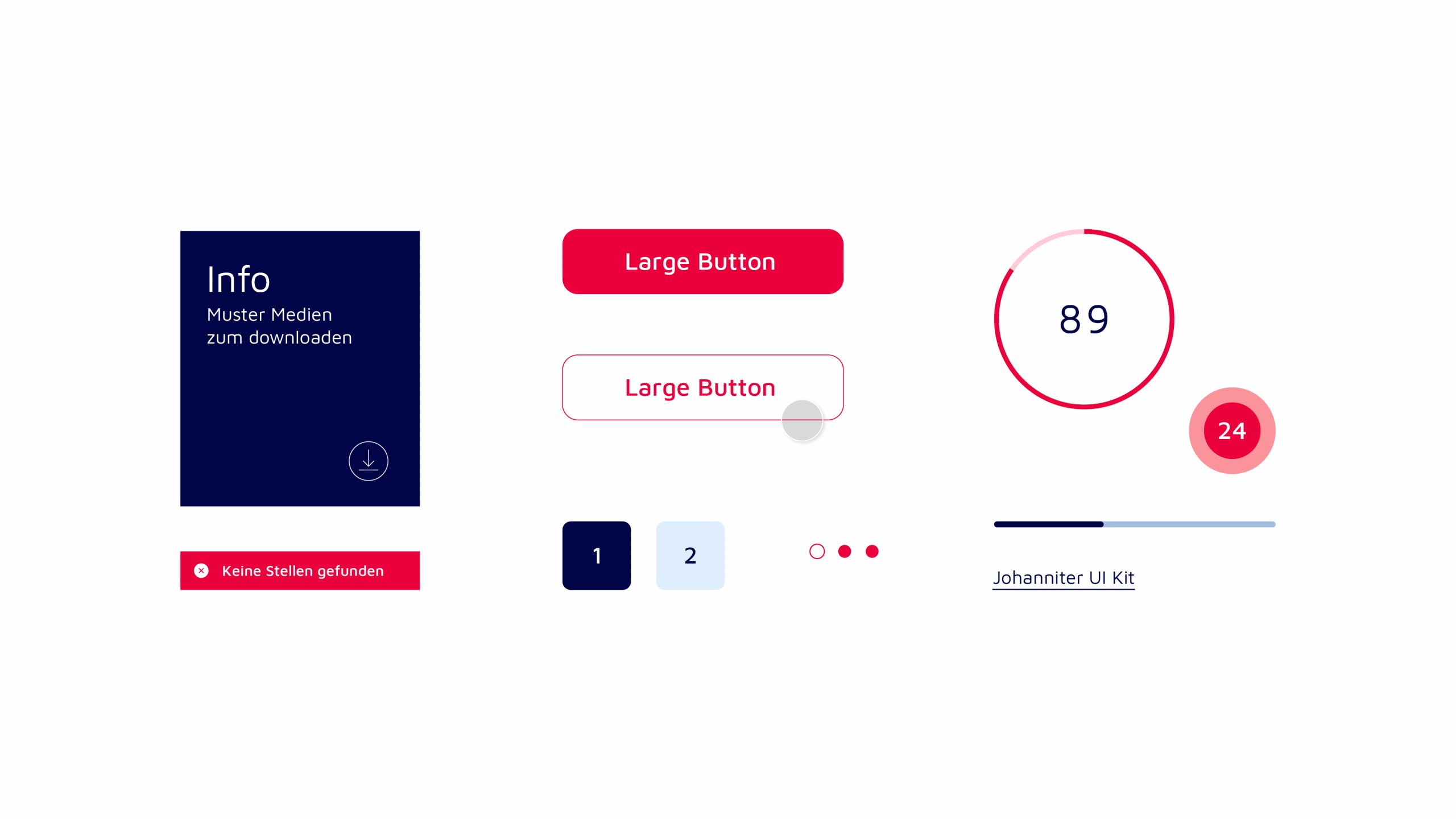
With origins dating back to the 11th century, the historic Johanniter symbol became the centerpiece of the new identity. Based on its core angles and round shape, a flexible design system lays the foundation for a clear graphic language. Brought to life through the usage of new colors, which differentiates them by not being just red and white like any other aid organization. Additionally, a variety of brand elements influenced each other to create a consistent and unifying identity, tied together by their core belief “For the love of life.”


Awards: Cannes Lions, ADC, New York Festivals
Say Hello
malte.preiss@gmx.net